
Delay the answer.
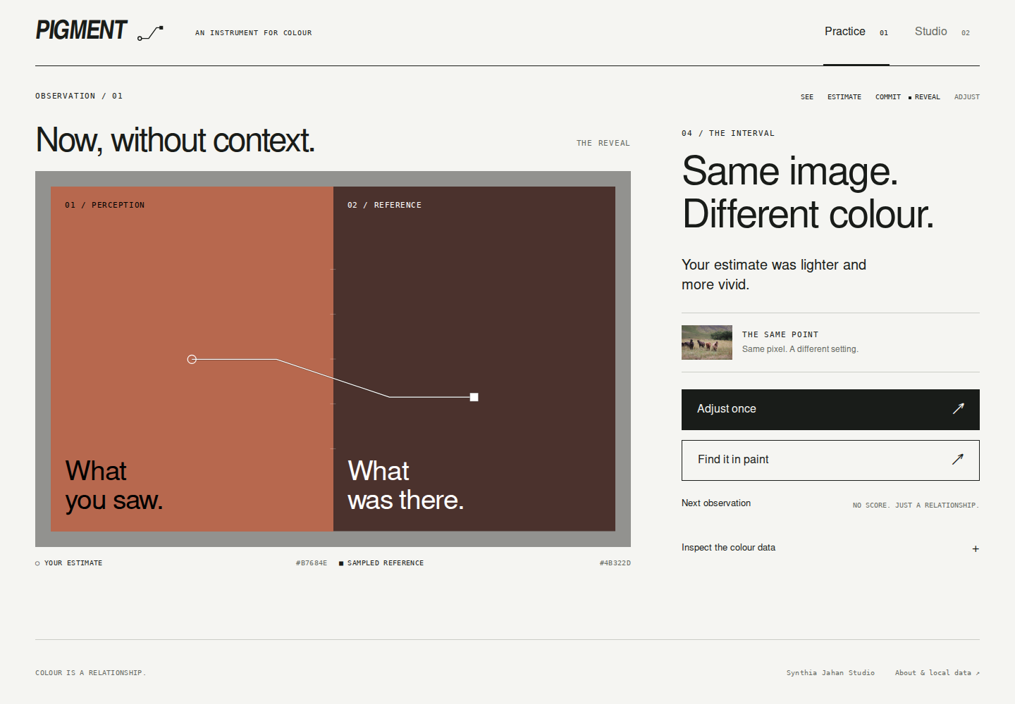
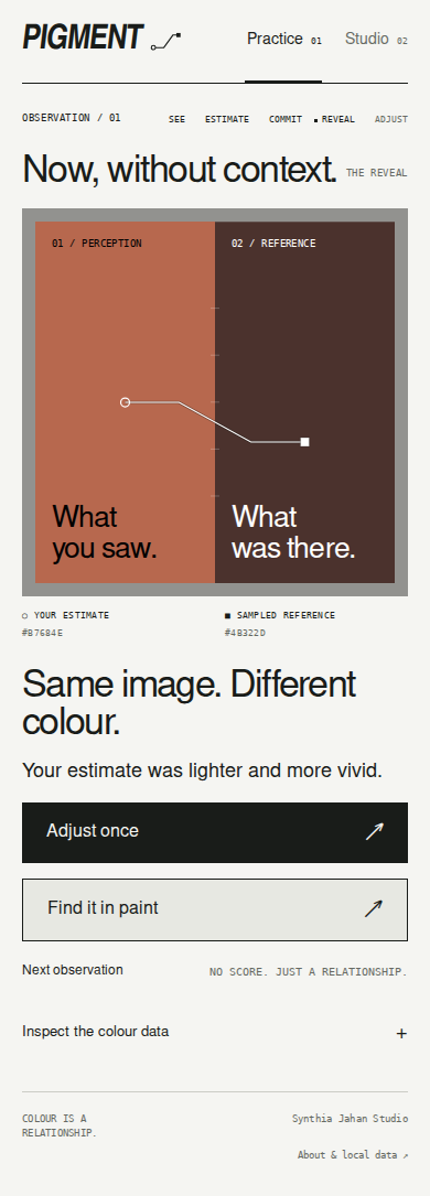
The estimate comes first. Committing preserves the original judgement so the reveal compares against what you actually thought you saw.
A meditation on seeing.
A colour-study instrument, born in the painting studio.
Look.
Make an assumption.
See what changes.
Trust your first impression. Then remove the surroundings.
The centre swatches are identical. Only their surroundings change.
Painting asks us to notice relationships: light and shadow, a warm note against a cool ground, the quiet emotion of a muted colour. A screen can give us a value. It cannot tell us what we thought we saw.
I made Pigment to hold that moment open. Colour theory becomes something to experience: estimate before the answer, compare without the surrounding image, then look again.
The aim is to learn to see more deeply.
Sun’s warmth on my skin on a cool fall morning. A moment of realization.
A working study from Pigment asks for a judgement before it reveals the sampled patch.

This is the real browser product. The sampled colour stays hidden until you commit. Pigment uses perceptual controls and patch sampling to make the gap between judgement and reference visible.
A sampled screen value is a reference for comparison; camera processing, display behaviour and real paint all affect the result.
Try PIGMENT ↗A blue can feel still. An orange can feel urgent. Change the colour and notice what it does to you.
This is a synesthesia-inspired sketch, not a claim that colour has one universal sound or emotion.
The estimate comes first. Committing preserves the original judgement so the reveal compares against what you actually thought you saw.
Estimate and sampled reference share a neutral ground. Hue, lightness and intensity can be considered separately.
Studio compares a reference with the paints you own and a catalogue. When nothing is close enough, that is a useful answer.
Practice trains the act of looking. Studio connects that judgement to the physical palette already on the painter’s table.
Pigment began as a studio problem, not an edtech premise. The current product tests a sharper question: can computational practice improve visual judgement without pretending that screen colour is physical paint?
The design deliberately separates what can be measured from what still needs real-world validation. That boundary is part of the product, not a disclaimer added afterward.
COLOUR IS A RELATIONSHIP.